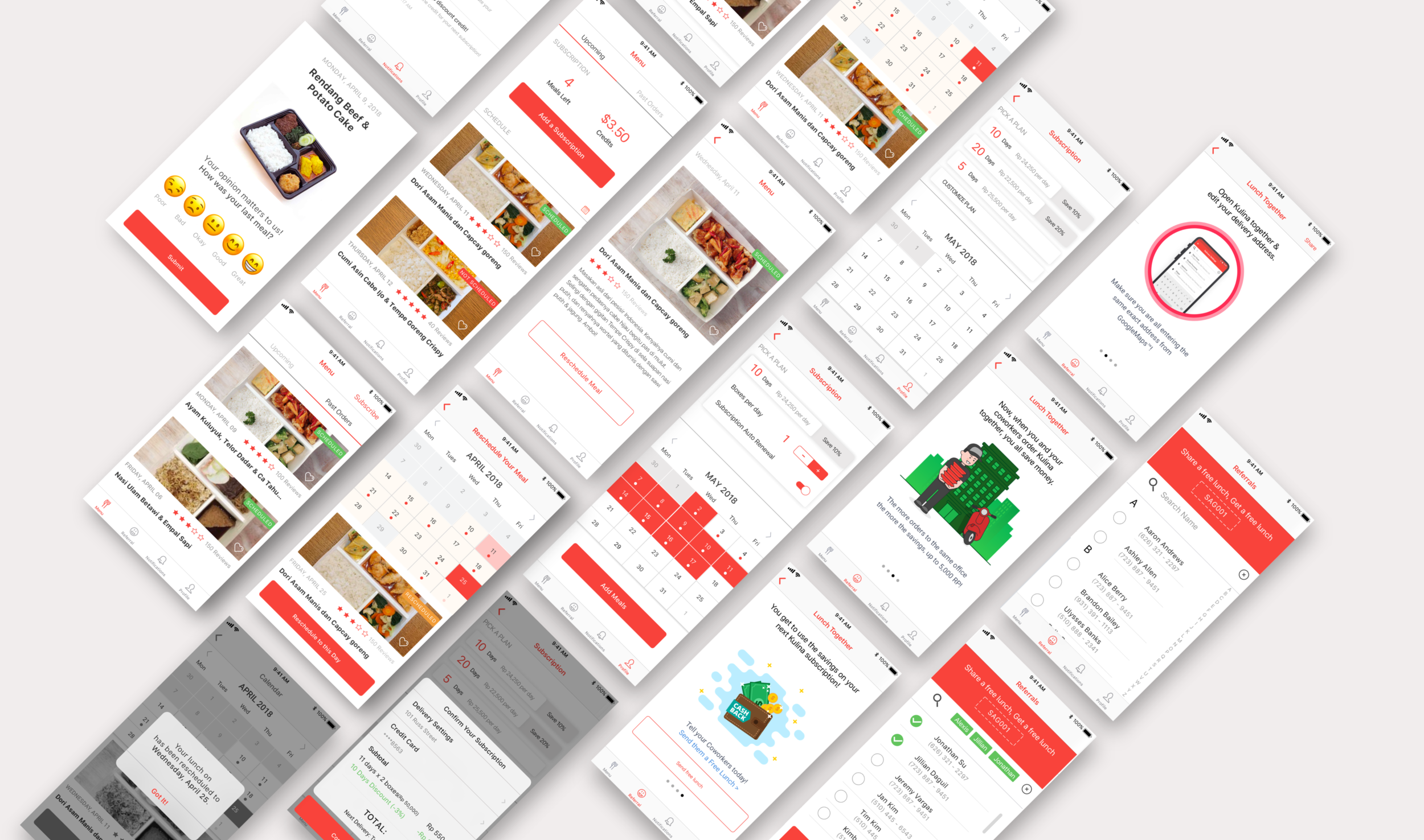
Lunch Delivery Mobile App
Mobile App
UX Design
UI Design
Kulina
"How might we better communicate the core features and increase customer feedback?”
Role : End-to-end product designer
Product: Native iOS mobile app
Client: Kulina - food delivery service in Jakarta, Indonesia
kulina has been selected as Google's Launchpad Accelerator programs.
Kulina is a food subscription service that delivers an easy lunch experience to the working professionals in Jakarta, Indonesia. By offering a variety of pre-selected menus every day, the level of decision making for the customer is minimal while receiving quality food that’s within their budget.
Challenge
Currently, customers can only access Kulina through a responsive website. In Indonesia, a responsive website is slow and requires the need to load content over and over again. This connectivity issue also affects customer feedback, as only about 30% or less of customers leave a rating on average.
Outcome
By building a mobile app to replace the responsive website backed by research, we aim to increase the number of people who give feedback and leave ratings in-app and also increase retention and engagement by clearly communicating Kulina's features.
We delivered the final prototype including all of the assets used in the final design. Kulina's engineering team is currently in the process of implementing our design recommendations.
Research
Competitive analysis
User interviews
Information architecture
Understanding Indonesia’s digital landscape in the food delivery service market is crucial to building a mobile app for Kulina. By looking at the local design pattern through competitive analysis, we were informed of the best practices to communicate the core features like the opt-in subscription with a flexibility to reschedule a meal at any point within the subscription period.
To further understand the current user pain points in navigating through the website, we conducted user interviews with the local working professionals. With the insights gained from the interviews, we iterated upon the information architecture of the existing website to identify the missing links in communicating the core features.
Competitive Analysis
Information architecture
Design Process
Establishing core tasks
Establishing brand style guide
Iterations on Lo-fi wireframing
notifications, ratings and feedback
Based on the research process we synthesized the main pain points:
Customers didn't have a good understanding of the opt-in service with the option to skip and reschedule a meal.
Customers feedback and communication was limited due to the expensive SMS rates and less than 20% email open rate.
Customers couldn't easily track or browse upcoming deliveries
To alleviate the communication pain points and surface the key features that Kulina offers, our initial design focus evolved around establishing the core tasks on the bottom navigation. Working in one-week lean design sprints, I iterated on design of notifications, ratings and feedback features in lo-fi through hi-fi design stage.
establishing core tasks for bottom navigation
Brand Style Guide
Lo-fi wireframing in Lean Design Sprint Iterations
iterations on feedback feature
Iterations on notifications feature
Iterations on In-app ratings feature
Final Design
As a food subscription and delivery service, Kulina was not receiving enough feedback from their customer base. Communicating the core features and the product value to the customers were some of the main pain points discovered in the process of building a mobile app.
In order to innovate Kulina's business to meet those customers' needs properly, we proposed simple and small changes in the information architecture organization of the mobile app that would create an easier and more efficient communication with the customers.
Reflection
The biggest personal takeaway from the project is that as a designer, I have to understand the context behind the problem that I’m trying to solve. With Kulina, understanding the cultural context and local design pattern had a big impact on a number of design decisions.
For example, finding a balance between a dense local design pattern and clearly communicating the product features was one of the main constraints I had to work around. Another consideration was the copy, as the translated Indonesian language can be lengthier than English. As a team, we placed extra emphasis on the visual hierarchy and concise copies to ensure that the visuals are aligned with the local visual pattern and that the translated copies can still get the meaning across our design.


