Ongo Science
"How do we best prioritize data for experts? What’s the best way to display the program data?"
Role: Product designer in a team of six designers
Product: Web Analytics Dashboard & scalable design system for engineering implementation
Client: Ongo Science
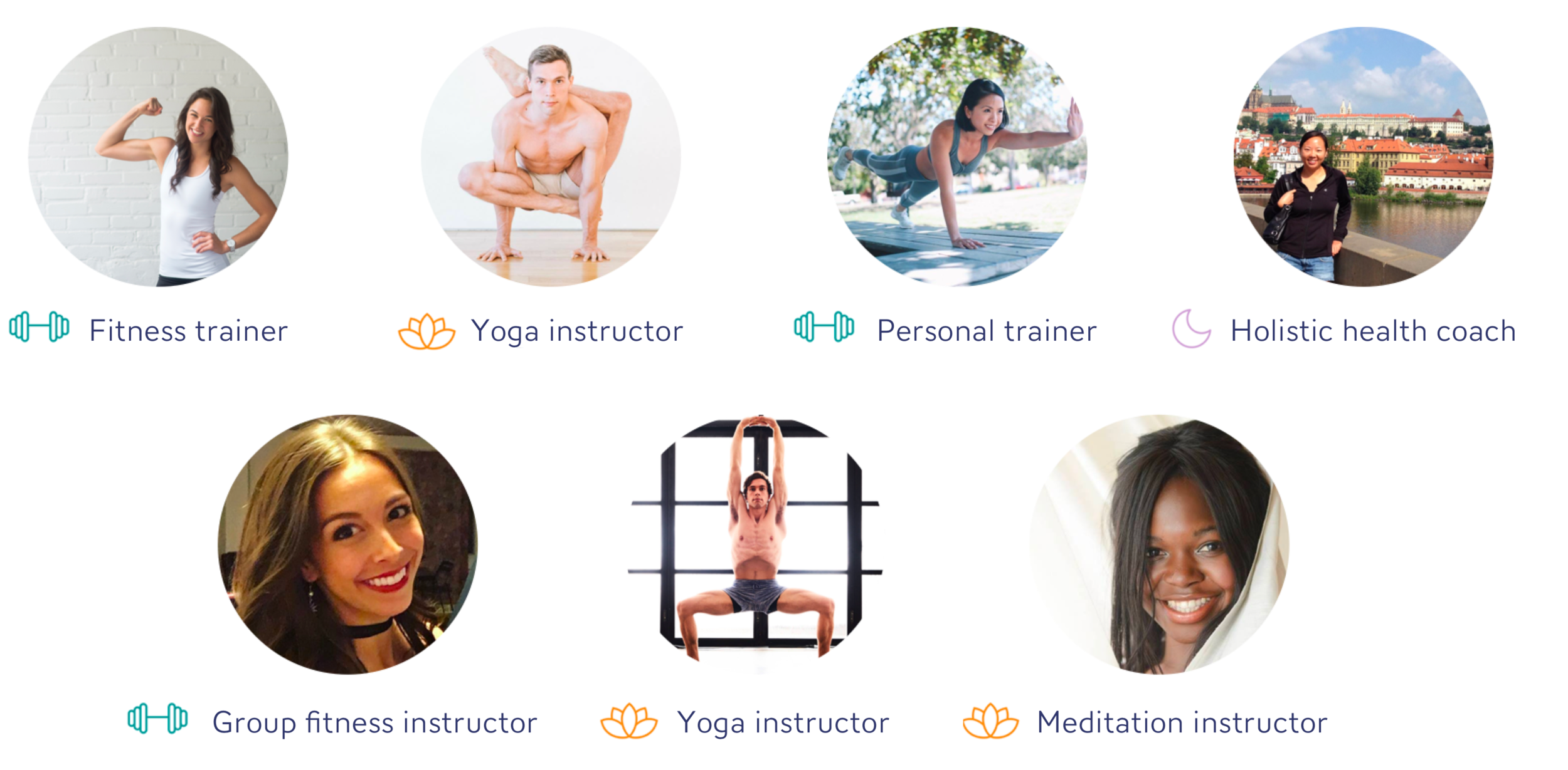
Ongo Science is a mobile health platform where wellness experts provide exercise and mindfulness programs for users to better their lives. With a two-sided marketplace model, Ongo serves users and experts to provide both groups with the benefits of a large network.
Challenge
Currently, when the experts like professional coaches and trainers offer programs for users on Ongo mobile platform, they do not have a platform to view the collected data on the users with tangible metrics.
Outcome
Our team designed a dashboard for fitness and wellness experts to easily review program statistics and insights, and see core metrics that will help them manage their programs. To validate our design, I set a success goal of 80% passing rate for the validation test I conducted with four trainers in a form of usability and comprehension tests. On average, 90% of the five experts we interviewed were able to successfully navigate through the dashboard with a clear understanding of their program's metrics and insights.
Research
Expert Interviews & Personas
Competitive Analysis Review
It is critical to understand what experts want out of a dashboard to determine what metrics and insights to surface and provide value to them for the success of their programs.
Through multiple interview sessions with seven wellness and fitness experts, we developed a few personas to summarize our assumptions and allow us to make clearer decisions with our users' needs and goals in mind.
Reviewing the interviews with competitive analysis of other dashboard products, we focused our efforts on the expert experience as we learned that providing information about the subscribers, revenue and acquisition channels is key to an expert programs' success.
user interview - wellness experts
Insights from Expert Interviews
Expert Personas
common patterns discovered from competitive analysis
Synthesis & Findings
Affinity mapping the key pain points
Open card sorting to prioritize metrics and insights
Site map of dashboard structure
Based on the insights surfaced from the research, we quantified the research findings and affinity mapped the pain points. We used the results from this synthesis process to work in a lean, iterative manner through rounds of quick design studios and dot voting the best solutions.
In addition, we used card sorting to group the common patterns uncovered from expert interviews to define our design opportunities. From this efforts, we discovered that having a dedicated program dashboard is necessary to better display all the critical data and metrics specific to the expert's program success. This decision is reflected in the site map of the dashboard.
affinity mapping the key pain points
open card sorting exercise to prioritize metrics and insights
expert dashboard site map
Sketches from design studio
Design Process
Lo-fi wireframing iterations - Program Dashboard
Final Overall Dashboard + Program Dashboard Design
As the team moved towards lo-fi ideation phase, we worked in lean design sprints to flush out iterations of lo-fi wireframes based on the sketches from the design studio.
Working with existing Ongo style guide and components, I co-led designing the program dashboard, which is a critical part of the overall dashboard to showcase important metrics specific to the expert's program(s).
Validation
Usability Testing
Comprehension Testing
To gauge how easy it is to navigate through and comprehend the purpose of the dashboard, we came up with a series of questions that specifically ask about the expert's understanding of the core metrics. Using the prototype we created with the hi-fi mockup, we performed a usability and comprehension testing with four of the experts we interviewed at the beginning of the project.


