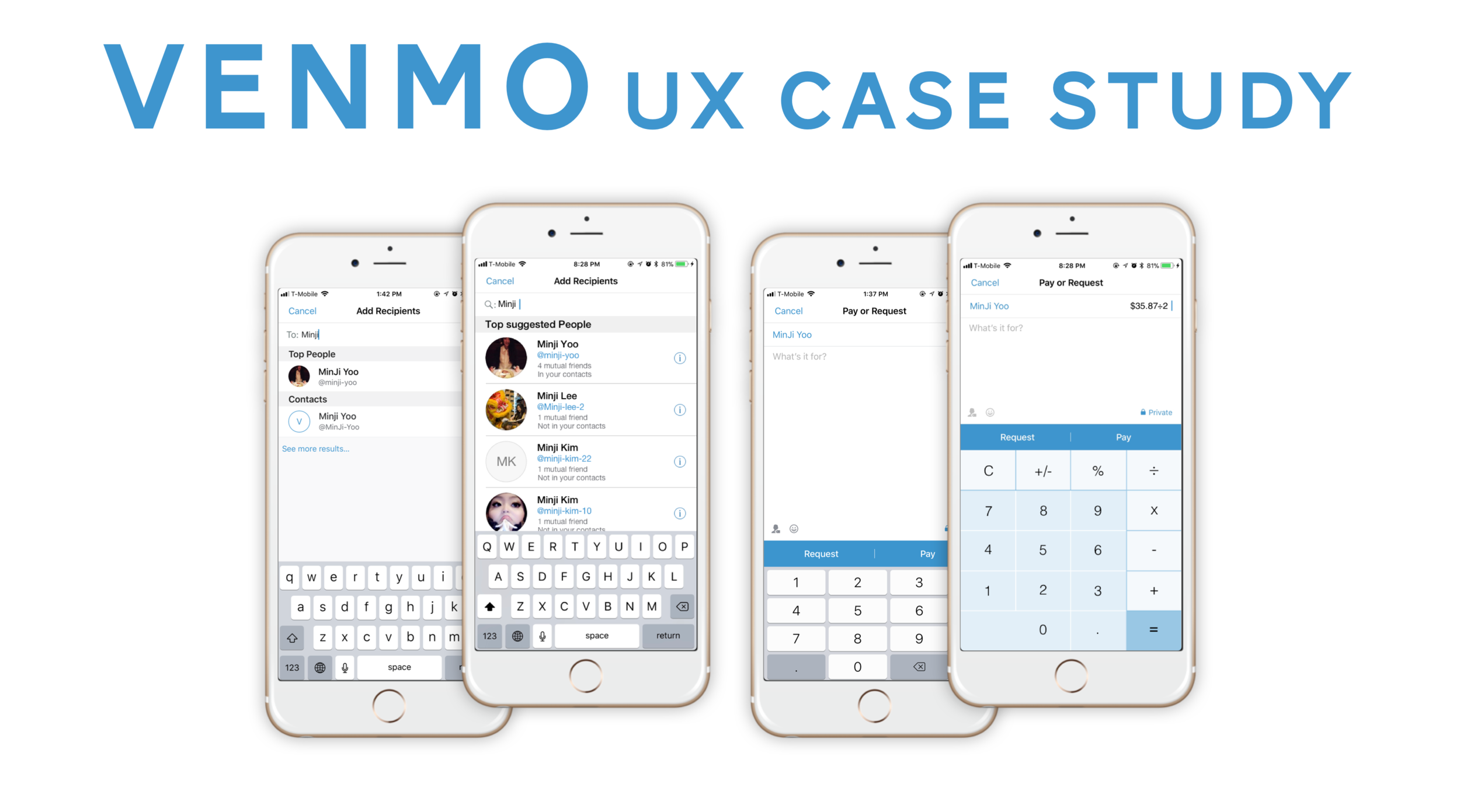
Venmo
"How well do users know about the existing features of the app?"
Role : ux researcher and product designer
Product: Venmo mobile app
Venmo's is a peer-to-peer payment app that offers their users a social and easy way to split up a tab or to request money from a friend. Combining financial service and social media, Venmo has ingrained itself into our cultural vocabulary, aka "Just Venmo me." As one of the most popular payment apps, I decided to case study Venmo to find out how well the users know about the existing features to maximize the user experience.
Challenge
An initial round of product research uncovered that there's a calculator feature that existed within the app. However, there was a discoverability issue which prevented users from optimizing the calculator feature. To alleviate this feature discovery issue that could have an impact on the business and improve the quality of service that the users experience, I decided to explore design solutions to maximize the feature discovery within Venmo.
Outcome
I redesigned the UI of the app to enhance feature discovery that is critical to user's goals. These design changes include optimizing the calculator feature within Venmo and giving visual validation to the user on the recipient's profile.
Research
- Job Story
"When I go out with friends,
I want to easily split the check with them,
So that I can enjoy dinner without worrying about cash."
- Guerrilla Usability Test
I summarized my assumptions about the users and created a job story to define the users' motivation and the intended outcome to meet their goal.
To get a qualitative feedback and quickly validate (or invalidate) how efficient the current Venmo design is and its discoverability assumptions I made on the intended audience, I perform a guerrilla usability test. I randomly selected five participants who have used Venmo previously and had them perform a series of tasks that include:
- Search for a recipient that you are not already friends with
- Calculate the amount you are sending to a recipient
- Complete transaction
Guerrilla Usability testing
Insights
- Affinity Mapping
After the guerrilla usability tests, I identified and categorized the common issues that all participants experienced in completing the tasks and affinity mapped the issues.
On top of not being able to easily discover the calculator feature, users also had difficulty identifying the recipient, when the person is not already friends with the user on Venmo.
Affinity Map
Synthesis
By quantifying the main pain points, I began to prioritize which problems to tackle and focus on first that would have the minimal impact on the business while addressing the biggest user needs. The three main pain points include:
People were not aware that Venmo has calculator feature within the app. Most people opened up a separate calculator app to calculate the split bill amount.
When confirming the recipient that the user isn't already friends with on Venmo, people had difficulty identifying if the search result was showing the correct recipient.
After being introduced to the calculator feature, people were confused as to how to complete the calculation without the equal sign.
Design Decisions
- Existing & Proposed Task Flow
- UI Sketches
By examining the areas within the existing task flow that generated the main pain points, I mapped out the ideal flow that is more intuitive and consistent, which allows the users to navigate through the app more easily.
I also sketched multiple iterations of the redesign for each screen that would address the pain points of identifying the recipient more easily and finding the calculator feature and completing the calculation within the app.
existing task flow
proposed task flow
UI SKETCHES
Redesign
calculator page redesign
add recipient page redesign
Search Recipients Result page redesign
Prototype & Validation
I created a prototype with the redesigned pages and tested it out with 5 individuals. I asked them to perform a similar set of tasks as the guerrilla usability testing:
- Search for a recipient that you are not already friends with on Venmo
- Calculate the amount you are sending to a recipient
- Complete transaction


